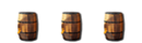
You're probably not done but if so, I would make it more like the logo we have atm. (The colors)
The logo needs to be darker. Also, in my opinion the S should be bigger like the picture below.

how did you put it against the BG if you don't have the .png?
plus you did it wrong.