


• Log in or sign up for an account here: https://www.sythe.org/login

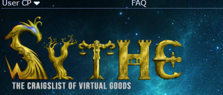
Feedback required - Sythe logo

Do you like this logo?

  • No i don't

    Votes: 65 42.8%
  • Yes i do

    Votes: 62 40.8%
  • I'm not sure.

    Votes: 25 16.4%

  • Total voters
    152
Joined
Feb 12, 2014
Sythe Gold
0
Messages
1,392
Location
In the Bazaar baby
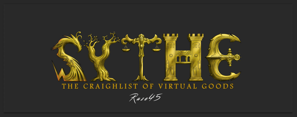
Live in the present, tried my best guys hope you like it and understand the meaning behind it * read bottom *

To all whom say this doesn't represent Sythe, what does?


5c0ec490c11f77d750c4c72672ca7dc1.png


9w5uU57.png

36777903ed116a975b1ca14287d584c1.png

6c3a464674858d2d5ed2324e4549fc7f.png

0bb15a9bf84954b1974b78182c949162.png

ALTERNATIVE (Thx for edits Jiwi):
UDdrB7J.png


OPTIONAL!

30d94641d38f1f54b6a30aa4d2e02bb8.png


7c4a08b2645ab4e0a1190912b7a7307d.png


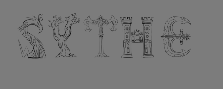
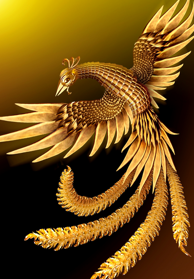
  • S= Is a Pheonix representing fire, power and loyalty.
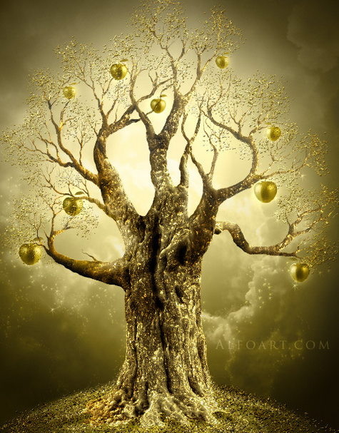
  • Y= is a tree representing growth and a strong roots.
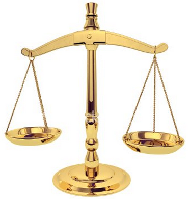
  • T= represents justice and equality.
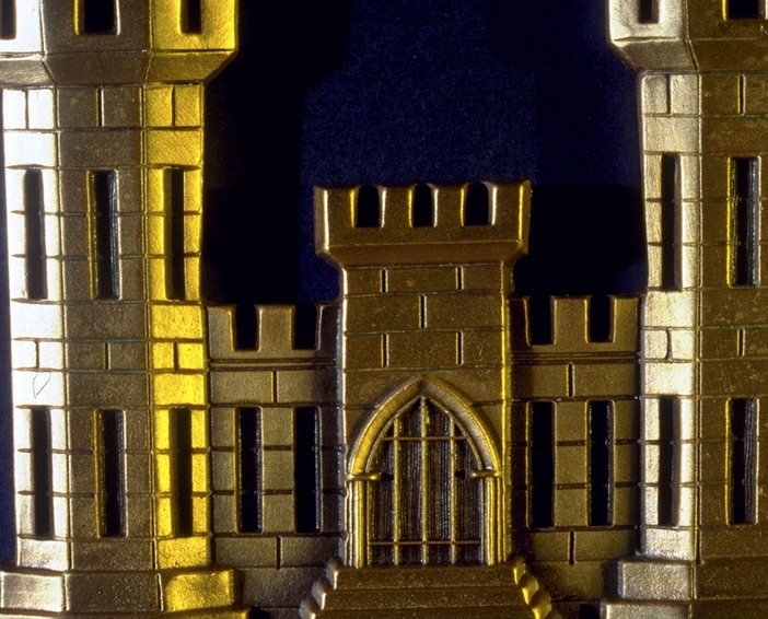
  • H= Is a castle, represents power and strength.
  • E= Is an anchor, representing that Sythe has been open for 10+ years, it's not going anywhere.

  • if you don't like it, give your reasoning
 
SOTMx5
Sythe Awards 2015 Winner
Sythe Awards 2016 Winner
In Memory of Jon
Did Richard contact you or you just want to create a sythe logo for fun?

Cause tbh I wouldnt suggest Richard to completly change the look of the logo everyone knows.


I feel like the drawings you did are awesome as always but I dont see it as a logo. Theres too much going on. I really like what you did tho and I would really love to see the result.

The first one is the best. Id suggest not to do all these things around sythe. Just write the slogan below with little effects to keep our eyes on Sythe.
 
Sythe's 10th Anniversary
I think the concept and idea behind the logo is creative. In my opinion, I feel like each letters are too seperated and have no connection. I think if you intersected each letters somehow, it'll look better.

It's rather different than the usual logos, but I'm sure you'll be able to pull it off. It looks great so far though.
 
Not sure if srs or just newfag...
Two Factor Authentication User
Wubba Lubba Dub Dub
MushyMuncher
Wait, do you not have an Archer rank?
Halloween 2014
Thats really cool. Good initiative.

Id suggest making the name in either the style of the T, the H, or the E. I bet all 3 would look awesome. With the different styles I feel theres a bit too much going on. The kerning of the Y and the T needs a little love, and I feel the kink in the pheonix's tail makes the S slightly too illegible.
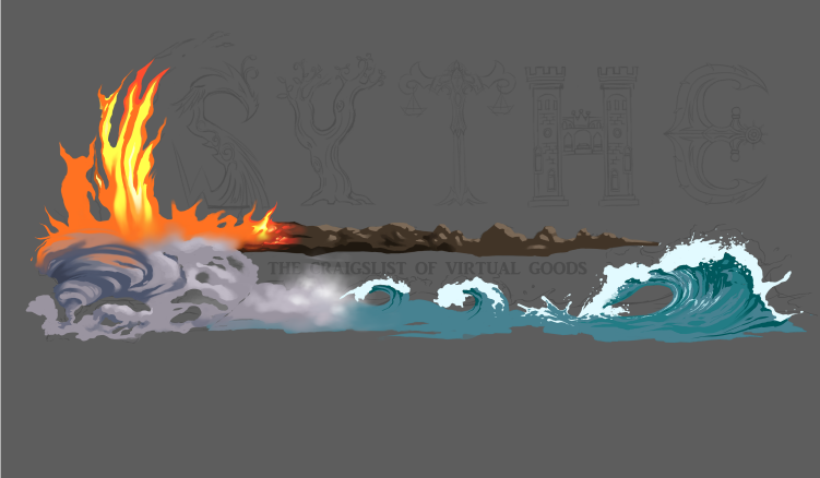
But really, its an awesome sketch- I could see finished versions in their respective fonts used as the actual logo. At very least part of a news letter. If you wanted to do the art for those the community development team would be a good place to start...I assume.

Edit: meant to say.. a version with the T in its style, and the rest in the style of the H would be my first choice. :)
 
Two Factor Authentication User
Did Richard contact you or you just want to create a sythe logo for fun?

I pmd Sythe (rich) to take a look at Raze's logos and possibly have him make a new one for Sythe.org

I've requested it be moved to community input, as it will receive more feedback/attention.

--

I'd like to see the logo gaming based, or see how it pans out at least. Well, that's just what I think may look good/cater towards the general use of this site.
 
Like many suggested, it's definitely nice.. Just couldn't see it as our new logo.
 
Simply because you have a meaning for everything make this logo worth much more than any other logo, it has a story,

Very nice job, I give you a 10/10 man.
 
Christmas 2014
Christmas 2015
Halloween 2014
Homosex
In Memory of Jon
It looks good, but I just don't see elements fitting as a logo for a blackmarket that deals with virtual goods. I guess there's too much detail in it for a site that has a very simple look.
 
It looks good, but I just don't see elements fitting as a logo for a blackmarket that deals with virtual goods. I guess there's too much detail in it for a site that has a very simple look.

what do you think of the text alone? (it's still a sketch and isn't coloured)
 
Christmas 2014
Christmas 2015
Halloween 2014
Homosex
In Memory of Jon
what do you think of the text alone? (it's still a sketch and isn't coloured)

I could only imagine it being colored according to what it's made from, it would be colorful like a rainbow which wouldn't look very professional or fit with Sythe's simple style. However it's very creative and looks good for other use. It would look good as a UI but Sythe doesn't allow colorful UIs.
 
I could only imagine it being colored according to what it's made from, it would be colorful like a rainbow which wouldn't look very professional or fit with Sythe's simple style. However it's very creative and looks good for other use. It would look good as a UI but Sythe doesn't allow colorful UIs.

What if it was gold, like Sythe's current logo
 
Christmas 2014
Christmas 2015
Halloween 2014
Homosex
In Memory of Jon
What if it was gold, like Sythe's current logo

I was trying to think if 1 color would fit them all, maybe it would. It's hard to imagine. Though I don't know how the Phoenix might hold on gold, it can be changed if it doesn't look good. In the end I hope you don't have expectations of replacing the current logo based on my opinion solely. The current logo was voted on by the community.
 
Back
Top