• Log in or sign up for an account here: https://www.sythe.org/login

Feedback required - Sythe logo

Do you like this logo?

  • No i don't

    Votes: 65 42.8%
  • Yes i do

    Votes: 62 40.8%
  • I'm not sure.

    Votes: 25 16.4%

  • Total voters
    152
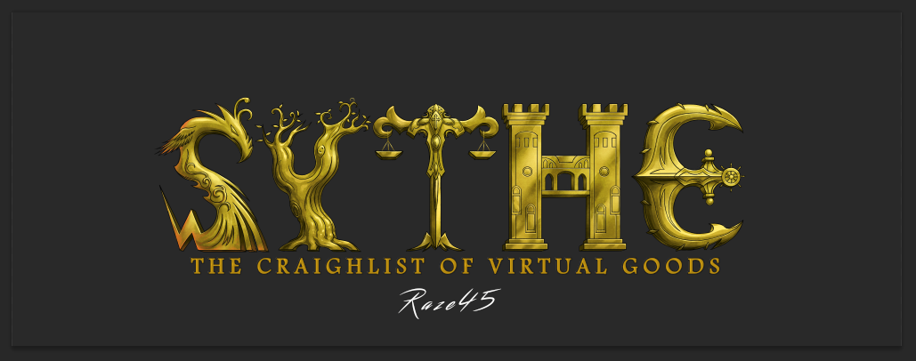
At the start I didn't like the idea of it too much, now that it's shaded and coloured I think it actually looks uniquely nice and would actually suit sythe. I don't like all the shit around the logo though, just the text itself.
 
At the start I didn't like the idea of it too much, now that it's shaded and coloured I think it actually looks uniquely nice and would actually suit sythe. I don't like all the shit around the logo though, just the text itself.

I'm glad that you've changed your mind, i noticed people couldn't get an idea of the finished product from a sketch or ink, so i hope the finished product actually pleases.

as for the elements, i removed them; they wouldn't suit the Sythe theme however i'll finish them for Richard incase he wants them
 
if you show any user that has been to sythe before
3c1fe66e6cddde448ca19a95162e9103.png
, they'll easily say it's sythe.

if you're saying the current logo is not simple compared to the one you want it to be then you've got a problem.
Nobody said that, stop twisting my words.
However it's way more complex than say bmw's logo

+ The only reason they'll recognize it is because of the fact it's been up there for quite some time now

Here's it 100% done.
5c0ec490c11f77d750c4c72672ca7dc1.png


I like it. Just reminding you that the letter centring is off.

fixed it
 
<3 n4n0
Discord Verified
Two Factor Authentication User
Community Participant
Spam Forum Participant
Sythe's 10th Anniversary
Sythe Awards 2011 Winner
might want to use spellcheck buddy

That can be changed in a few seconds, thanks for noticing it was a typo.

Have any opinions on the logo itself?

Keep it with the big S and all others smaller imo

wouldn't be a problem on my behalf.

I really like that. I wish the bottom right of the S was more S like, but I love it overall.

I'm glad you like it,

as for the S I thought it brings out the uniqueness, i could have easily made a normal S shape but then what character of a phoenix would that have shown :p?
 
Two Factor Authentication User
SytheSteamer
That can be changed in a few seconds, thanks for noticing it was a typo.

Have any opinions on the logo itself?

Yeah. KISS - Keep It Simple Stupid.

It looks more fan art than a professional logo.
 
I really like the design of the logo I feel it encapsulates the theme of the website well. The only suggestion I'd have is possibly making it slightly darker to blend in with the background, as the current logo does.
 
In Memory of Jon
<3 n4n0
Sythe Awards 2013 Winner
Sythe Awards 2014 Winner
Sythe Awards 2015 Winner
Between the Y and the H just looks like a hole in the design - T should be thicker. Good job, I like that you toned down the graphic intensity but I still prefer the current one :/.
 
I mean, the logo isn't going to appeal to everybody;

i looked back at the voting for the current logo and many people had voted for the other logo's, it's completely subjective.

Thank-you guys for having the time to respond, i really appreciate that,
 
Back
Top