


• Log in or sign up for an account here: https://www.sythe.org/login

[ADMIN]Fix up user services subforum

Status
Not open for further replies.
SOTMx5
Sythe Awards 2015 Winner
Sythe Awards 2016 Winner
In Memory of Jon
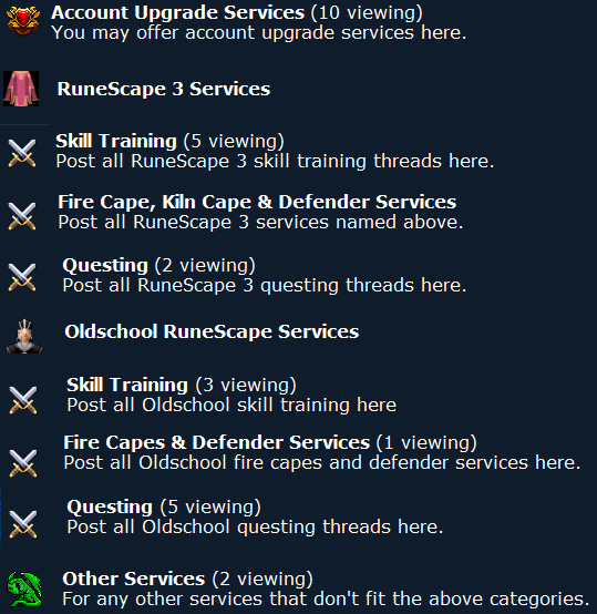
On second thought I think it'll look just as chaotic if done to what you said above. The only fix to make it look a bit better I think is to use the same icon for the subsections of RS3 and OSRS - like so:
ee2fa566b3.png

I agree with Roary but I know we can make it better than this.

Is it possible to do that? :

JQpvCJl.png
 
In Memory of Jon
<3 n4n0
Sythe Awards 2013 Winner
Sythe Awards 2014 Winner
Sythe Awards 2015 Winner
if it was do u think i wouldnt have done it ;)
 
SOTMx5
Sythe Awards 2015 Winner
Sythe Awards 2016 Winner
In Memory of Jon
if it was do u think i wouldnt have done it ;)

XD, well should we separate them then? Like 2 sections in the skill training. One oldschool, one rs3 and then you would have each subs IN them?
 
In Memory of Jon
<3 n4n0
Sythe Awards 2013 Winner
Sythe Awards 2014 Winner
Sythe Awards 2015 Winner
But it would appear like that ^ that's what that is
 
SOTMx5
Sythe Awards 2015 Winner
Sythe Awards 2016 Winner
In Memory of Jon
But it would appear like that ^ that's what that is

No I mean, If we cant do like I posted above, maybe its better to just do 2 sections within the Skill training section.


What I would maybe suggest:

When you click user services, you see 3 things. Account Upgrades..., Oldschool Services, RS3 Services (in skill training). When you click oldschool or rs3 services, you will be directed to the other choices.

You have to click twice in order to go where we want to if we do this but its more organized.

Idk if you understand what I mean. If not, tell me and ill show you with photoshop lol
 
In Memory of Jon
<3 n4n0
Sythe Awards 2013 Winner
Sythe Awards 2014 Winner
Sythe Awards 2015 Winner
that's how it looks I can't hide the sub-sub sections
 
In Memory of Jon
<3 n4n0
Sythe Awards 2013 Winner
Sythe Awards 2014 Winner
Sythe Awards 2015 Winner
On the main page? Nah..
 
Two Factor Authentication User
Discord Verified
In Memory of Jon
Heidy
PHP Shit Show 2k26
STEVE
Summer 2016
On second thought I think it'll look just as chaotic if done to what you said above. The only fix to make it look a bit better I think is to use the same icon for the subsections of RS3 and OSRS - like so:

ee2fa566b3.png

This looks better than what it's like now haha. Definitely support this.
 
In Memory of Jon
<3 n4n0
Sythe Awards 2013 Winner
Sythe Awards 2014 Winner
Sythe Awards 2015 Winner
Need a brighter icon for OSRS
 
SOTMx5
Sythe Awards 2015 Winner
Sythe Awards 2016 Winner
In Memory of Jon
that's how it looks I can't hide the sub-sub sections

Ah k then I support what you did

here. Looks better than what It is now.

On second thought I think it'll look just as chaotic if done to what you said above. The only fix to make it look a bit better I think is to use the same icon for the subsections of RS3 and OSRS - like so:

ee2fa566b3.png
 
Discord Verified
Two Factor Authentication User
On second thought I think it'll look just as chaotic if done to what you said above. The only fix to make it look a bit better I think is to use the same icon for the subsections of RS3 and OSRS - like so:

ee2fa566b3.png

You're missing the torso services.
 
In Memory of Jon
<3 n4n0
Sythe Awards 2013 Winner
Sythe Awards 2014 Winner
Sythe Awards 2015 Winner
Yeah it'll go w/questing.

Need suggestions for an icon for OS.
 
Status
Not open for further replies.
duelarena.gg
Back
Top