




Don't be afraid to fail... Be afraid not to try.






On second thought I think it'll look just as chaotic if done to what you said above. The only fix to make it look a bit better I think is to use the same icon for the subsections of RS3 and OSRS - like so:
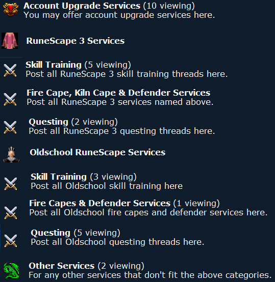
I agree with Roary but I know we can make it better than this.
Is it possible to do that? :