



spokesman

- Joined
- Oct 28, 2012
- Sythe Gold
- 1,154
- Messages
- 10,442
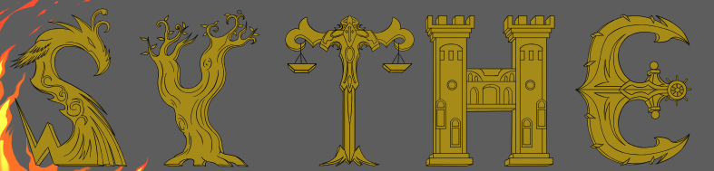
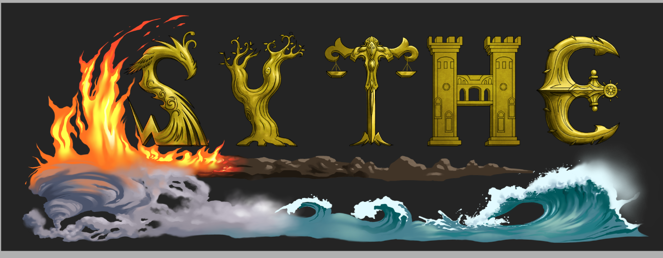
Not surprised to see people following the sheep narrative of keeping logos simple and boring. While most of the time a simple logo is the objective for high end businesses, this does not pertain to all, and in doing so restricts creativity and imagination. This is a black market forum that heavily supports fantasy games for intangible goods. Why is it far fetched to create a logo that embraces that description? It's encouraging to see Richard support that ideology.
My only criticism is the anticipation of a logo that looks too cartoonish. I hope you're able to avoid that, otherwise I see no problems. I like story behind the lettering as well.
My only criticism is the anticipation of a logo that looks too cartoonish. I hope you're able to avoid that, otherwise I see no problems. I like story behind the lettering as well.









 - if there was an option between a significant fantasy themed logo and a simpler one I'd choose the simpler one, I don't want to see a heavy graphic on every page personally.