


You are using an out of date browser. It may not display this or other websites correctly.
You should upgrade or use an alternative browser.
You should upgrade or use an alternative browser.
Feedback required - Sythe logo
- Thread starter Raze45
- Start date
More options
Thread ID: 1821219



Looks really good to me! You're clearly talented.
Thanks.
I've started inking it;

Wanting some more responses guys 
Expect a finished version by Saturday.
Expect a finished version by Saturday.





It has been inked





Same size looks better. Unless, you make the S significantly bigger.
Alright, changing the sizes won't be a problem




Pure text looks better than the colored one. Good luck & keep it up, I would love to see the final version of this ^_^
Alright, the environment can be removed anyway.
And thanks




You should shift the "the" part of sythe a little closer to the y, as it is now I think the 2nd half is a lil farther a part and would look better if it was pushed a lil closer. Not a biggie, just a small thing I noticed
You should shift the "the" part of sythe a little closer to the y, as it is now I think the 2nd half is a lil farther a part and would look better if it was pushed a lil closer. Not a biggie, just a small thing I noticed
I'll shift the text around once finished, thanks for noticing.

Looks amazing so far, wouldn't mind it as the new logo.
Thanks for the kind words Swaze.
flat colours added
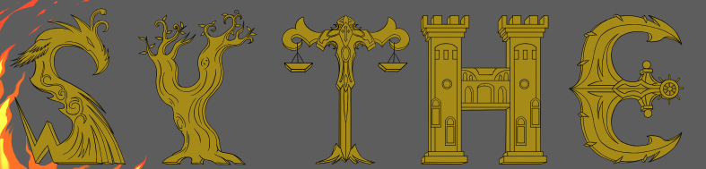
yet to be shaded for texture and detail.
yet to be shaded for texture and detail.
the spacing between the letters looks un-even.
That's not a problem fixing, i'll do it at the end don't worry
still 1 step left before finished.
Similar threads


- Replies
- 6
- Views
- 946


- Replies
- 55
- Views
- 3,318


- Replies
- 3
- Views
- 886

