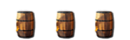
Not a huge fan of it tbh :s
Too much red, and the fonts/layer styles aint all too impressive.
At first glance it looks kinda cool though, but as you see the details the cool factor disperses.
Edit, Mods have specified that this section is for your own artwork
the render is cut out poreley an i dont like the red wayyy too much. an you skype sticks out too much an unbalances the design. well it kinda balances it out with the rocket but its not red so it makes it look ulgy.



 he made one for me and personaly i love it
 looks epic