- Joined
- Mar 19, 2023
- Sythe Gold
- 4,680
- Messages
- 288


Votes can not be seen or changed. Please read post before voting!



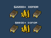
I believe there are two issues with the font style chosen for all ranks sitewide. The first issue is the font style is faint and hard to read (narrow & condensed). The more letters or numbers in a rank title, the harder it is to read. The second issue is the size of the font. The size being as small as it is in combination with the narrow and condensed nature of the font makes it terrible for the eyes. I'm not going to suggest a specific font because everyone has different tastes, but if many of us can agree that a change would be better, then I believe a community vote on different font styles would be the best route to reach a consensus on a desired result. I also want to note that I'm not asking for the font size to be considerably bigger (1 or 2 sizes up is preferrable).
Last edited:






















 " lol