

• Log in or sign up for an account here: https://www.sythe.org/login

Hey Guis! *wavewave*

Kola

Member
Joined
Nov 11, 2009
Sythe Gold
0
Messages
61
Location
Awesometopia
I got a new sig for ya'll to criticize ;).
Now i couldn't decide which version was better so im gonna post all three and you tell me which one is the best MMMKKAAAYYY?!

VS1;
dahncevs1.png


VS2;
dahncevs2.png


VS3;
dahncevs3.png


inspirud by;
[YOUTUBE]SCkQ2byhBxU[/YOUTUBE]
note; skip to 2:14 if you are impatient.​
 
i like more version 3. has very nice flow, lightining and depth. but dont likke the border
 
I did that kind of border on purpose to elongate the signature and create more depth/flow.
 
i like more version 3. has very nice flow, lightining and depth. but dont likke the border

Pfft, I don't know about you, but I love the border.

Anyways, in v3 the abstract object on the right really makes the sig stand out. Incredible flow, good job. Can't think of anything to criticize about =]
 
Lawrence
Potamus
I'd say get rid of the border along the bottom and side.
Background is empty.
 
its supposed to be empty. If i overload the sig with too much, it takes away the focus and the emotion ;).
 
Lawrence
Potamus
its supposed to be empty. If i overload the sig with too much, it takes away the focus and the emotion ;).

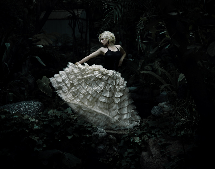
Foreground and no borders aswell as the way it flows suggests that this is a snapshot of a much bigger picture. Except with the current background she is sitting against a wall. Don't get me wrong though, it is very well made
 
Foreground and no borders aswell as the way it flows suggests that this is a snapshot of a much bigger picture. Except with the current background she is sitting against a wall. Don't get me wrong though, it is very well made

patrickhoelck-4a7a2193dc040.jpg
 
I think the v3 is great but somehow I feel that is it too dull..
 
Tag is a bit dull, more could of been done with it.
Added some colors maybe you could've added some c4d's or other effects.
 
v3. If you aren't going to get rid of the border (since it's actually pretty creative/dynamic), make it far thinner, about 2px max.

Also, you need a more dynamic background to compliment the focal/subject, and the c4d on her arm doesn't work.

Try maybe effect c4ds/a star/nebula stock?
 
Back
Top