

You are using an out of date browser. It may not display this or other websites correctly.
You should upgrade or use an alternative browser.
You should upgrade or use an alternative browser.
Ten Thousand Fists
- Thread starter Burt
- Start date
More options
Thread ID: 486007

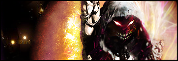

Yeah, same. The red thing on his eye is kinda out of place and not fitting.
W
Wise Choice
Guest
i donts really like its got potential but the red eye thing has to go and mat ybe blend the left side of it in abit more? thats just my opinion, also can somone tell me what BB i need to put in to show my sigs???
thanks
thanks

- Joined
- Mar 30, 2008
- Sythe Gold
- 0
- Messages
- 288
- Age
- 35
I've seen most of your work, and it's not bad, but I think your sigs are starting to look repetitive. It seems like they're all the same sig, but with different render. I know they aren't, obviously, but I think you should try a new style.

can somone tell me what BB i need to put in to show my sigs???

Besides the red spot, it looks really great.
T
The True Gears
Guest
It looks like you're using the same effect over and over for your newer sigs, not saying its a bad effect, its really neat actually, but I think you should look up something different

don't feel it. I hate that render, it's not blended enough, the text is stupid. right corner is too bright

Honestly, I fucking love Disturbed. Basically any sig with Disturbed in it pwns, not gonna lie haha.

isnt that bad better than anything i could do lol. gj and keep practicing

Similar threads


