• Log in or sign up for an account here: https://www.sythe.org/login

Signture How did i go? for a slice/design wise

FiveBots

Beep Boop I'm a motherf**king bot

$100 USD Donor New
Joined
Jun 24, 2013
Sythe Gold
789
Messages
913
Location
Victoria Autralia
PHP Shit Show 2k26
Simplity is the key here!
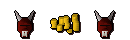
This is my first time slicing (which was extremely easy) but does it look clean?

I am looking to replace the gmauls with bots / marco looking clothing but oldshool XD but can't find a transparent one

​
 
Lion King
Pokémon Trainer
In Memory of Jon
Rio 2016
Summer 2016
Torchbearer 2016
Hey, I think the clue scroll should be moved or removed in my opinion. But it looks very nice after that is done. The g-mauls could use something surrounding them possibly on the edges (an outline or glow). The gold might look better if you had a little shine to them somewhere. These are just some suggestions though. It looks like a really good signature in my eyes =).
 
Member of the Month Winner
Sythe's 10th Anniversary
Wubba Lubba Dub Dub
The Mortyest Morty
Discord Verified
Sythe Awards 2012 Winner
Le Kingdoms Player
Two Factor Authentication User
Spam Forum Participant
I'm LAAAAAAAME
Signature of the Month Winner
You should keep your text more consistent rather then having 3 different fonts for all 3 pieces. The layer styles on FiveBots are also overdone which makes it look harsh and low quality.
 
PHP Shit Show 2k26
i see, but i used a Runescape UF font on the Runescape gold for a reason, but the Vouches need to be something us rather than BatmanForever, if someone could improve this i would like to see :D i trying to learn, even if you send me though Skype the PSD,
Thanks,
Fivebots

Beginner Graphics maker
 
Runescape Gamblingrunescape gambling
Back
Top