Hey guys. I'm going to post my best sigs that you've never seen. When I say best, I mean very old, yet better than some of the new ones I've made. I made these in my absence from sythe. When was that? It was from November to about March last year. I couldn't access sythe no matter how hard I tried. I made these sigs for people in my brothers clan. If you know my brother's username, or the clan name, please don't reveal it. I can't post .psds as I made these on his computer, but you guys know it's kiabin, and his biggest pet peeve is sig ripping. I can tell you all of the ways I did effects if you just ask me. CC is much appreciated. I'll only be posting the ones that had the best outcomes.
First one on his computer. It was more of a beginner tutorial for him to know what I do, and what I can do for his clan members .

Beat somebody in a battle with this one. The kid I beat was a fag, and he was better than me lmao.

You've all probably seen this. It was just a normal sprite sig. I tend to wear it a lot.

This is definitely one of my favorites. I only wish the lines I did weren't in color .

I love the outcome and time I put into this one.

I've worn this a lot also. The thing on the left isn't pentooling, it's a c4d .

I love the outcome of this one. Just the time and use of effects put into it. Although, I know it could blend more, it's one of my better earlier sigs.

I was following a tut on this one, and got drifted away. I have blurred a bit of a wireframe in the background, and that's the only thing I really don't like about it.

Followed a tut for this one.

Made this for my premade section

Of course, my current sig. It's one of my favorites definitely. I love everything about it. I couldn't think of an idea on it, and then it dawned on me. What if I moved the stock and didn't change it much? The use of effects is still good in my opinion.
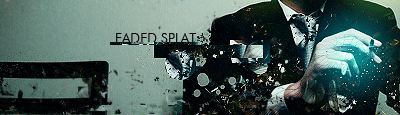
I love the gradients I put into this. I found a semi light yellow and a very light blue and did a gradient map. I set the map to lighten.

This one was 10 minutes .

This one I had nothing going on until I decided to add a normal b&w gradient map and lower the opacity. I also added a dark red and black gradient map and erased it with a splatter brush. I sort of like the turnout of it.

I tried topaz clean for 30 days, and didn't like this result.

I just simply added some small bubble c4ds and a wireframe c4d to a normal stock photo, and sharpened it. That's the signifigance to this one.

I made this one like 2 months ago. It's easy to tell it's mine.

I don't like this outcome much.

Well, I came clean and finally posted them. Post CC if you wish, and rate, or do anything. These are old, so don't be too harsh .
First one on his computer. It was more of a beginner tutorial for him to know what I do, and what I can do for his clan members
.
Beat somebody in a battle with this one. The kid I beat was a fag, and he was better than me lmao.
You've all probably seen this. It was just a normal sprite sig. I tend to wear it a lot.
This is definitely one of my favorites. I only wish the lines I did weren't in color
.
I love the outcome and time I put into this one.
I've worn this a lot also
. The thing on the left isn't pentooling, it's a c4d .
I love the outcome of this one. Just the time and use of effects put into it. Although, I know it could blend more, it's one of my better earlier sigs.
I was following a tut on this one, and got drifted away. I have blurred a bit of a wireframe in the background, and that's the only thing I really don't like about it.
Followed a tut for this one.
Made this for my premade section
Of course, my current sig. It's one of my favorites definitely. I love everything about it. I couldn't think of an idea on it, and then it dawned on me. What if I moved the stock and didn't change it much? The use of effects is still good in my opinion.
I love the gradients I put into this. I found a semi light yellow and a very light blue and did a gradient map. I set the map to lighten.
This one was 10 minutes
.
This one I had nothing going on until I decided to add a normal b&w gradient map and lower the opacity. I also added a dark red and black gradient map and erased it with a splatter brush. I sort of like the turnout of it.
I tried topaz clean for 30 days, and didn't like this result.
I just simply added some small bubble c4ds and a wireframe c4d to a normal stock photo, and sharpened it. That's the signifigance to this one
.
I made this one like 2 months ago. It's easy to tell it's mine
.
I don't like this outcome much.
Well, I came clean and finally posted them. Post CC if you wish, and rate, or do anything. These are old, so don't be too harsh
.