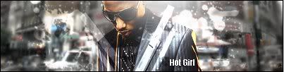
Okay I'd love to give you some constructive criticism. Please read it all, and take most of it for granted.
-The render you used is WAY too big. I know, as I've used the same one before.
-There appears to be a C4D, but, instead of adding a nice soothing feeling, you color burned it. That's a
NO-NO 
.
-I don't use text in half of my sigs. If text doesn't look or feel right, don't add any! Your text stands out and distracts me from the focal.
-The background. Nice backgrounds are supposed to be made from 2 colors of the same color oh, what do you call it... Race? For instance, on the render there are 2 colors of reds, a dark and a light. Take the teardrop tool with the gradient tool open and take the dark color and the light and make a background. That's the first thing you do.
-Lighting and Effects. C4ds are great effects for signatures, but don't over use them. If you look in my sig, I have 1 bubble c4d effect and then a wireframe c4d effect. That's a total of 2 C4D's and a LOT of gradient maps

. As for lighting, all you have to do is take a soft brush with white set as the color and click where you see the lighting coming on the render/stock. Look at mine for instance, the light you can clearly see is coming from the face, I added an orb of light and lowered the opacity to my likings. You can either lower the opacity, or set it to lighten. But, if you do set it to lighten, it'll be weak, but somewhat noticeable. You can always duplicate the layer that you set to lighten to stronger it.
-Conclusion. If you set your mind to it, you can do anything. My first sig SUCKED! I knew it sucked, and I hated it. I'll find you an example of what I used to be like.
This is my first photoshop sig EVER!
I thought it was everything GOOD in Gfx when I made it. And overtime I evolved into higher skills through constructive criticism, tutorials, and just messing around with photoshop.
This is what I turned into.