• Log in or sign up for an account here: https://www.sythe.org/login

Future Bass Album Cover

Bear Clawz

Member

Banned
Joined
Jul 31, 2014
Sythe Gold
0
Messages
68
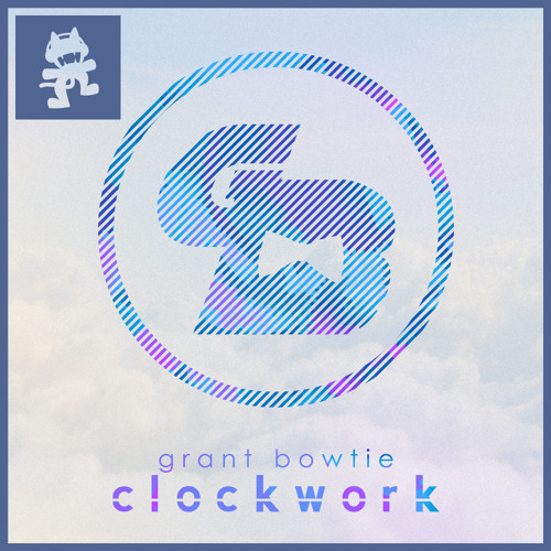
First time I've ever made an album cover. Started out experimenting with some photos and it turned out really well, so I decided to make something out of it. The guy didn't ask me to do it or anything, just did it for fun :D .

This is his current single cover art:
artworks-000098819550-jzdl9z-t500x500.jpg


This is my remake of it:
Clockwork-Bowtie-Single-Cover_zpse21f0e59.png


Tell me which one you like better. The artist makes electronic (Future Bass) music, BTW.
​
 
In Memory of Jon
Gohan has AIDS
Pokémon Trainer
Poképedia
Dang man you've got some awesome skills. I personally like the second one much more in the original than your edited version. The font looks better and it looks like something I'd see on an actual album cover. First one is a bit boring. What kind of music is he making?
 
Member of the Month Winner
Sythe's 10th Anniversary
Wubba Lubba Dub Dub
The Mortyest Morty
Discord Verified
Sythe Awards 2012 Winner
Le Kingdoms Player
Two Factor Authentication User
Spam Forum Participant
I'm LAAAAAAAME
Signature of the Month Winner
I wouldn't say your choice of font is the issue rather just the overly bright color scheme. It's just too bright and the text doesn't stand out from it - in fact the W can be hard to even see at first glance.

Your version of the GB logo is very sloppy also.


EDIT: On the edited version from what I can see the differences are: Different text, the monster cat logo being blue, the border being blue. In my opinion the light blue border & logo doesn't quite work despite the similar approach being used above - likely since in the original there was also a couple of other colors so as it didn't become too one dimensional.
 
I'll explain why the first one is very appealing:

The colors used for the piece go nicely together.
Character placement is very well done.
The logo is creative and does the foreground justice.
The whole piece is smooth.

This is what I dislike about your version:

The size is too big.
The borders are too thick.
Placement of text.
The blur.
& the color scheme.

I think you should look at other album covers to get an idea of how to create an effective cover in terms of appeal. It's not bad for your first time.
 
I agree with Ghast, the first one is alot more professional and alot more cleaner. I think you should put the background based around the type of music that your making.
 
I might make another one soon to improve. I originally wasn't making an album cover anyway, just thought It'd be some good practice for if I ever had to make one in the future.
 
In Memory of Jon
Gohan has AIDS
Pokémon Trainer
Poképedia
Is the Grant Bowtie made by you or is it the person you're making it for? It's really choppy and should be fixed before you keep going.
 
Is the Grant Bowtie made by you or is it the person you're making it for? It's really choppy and should be fixed before you keep going.

No, I didn't make the logo, but I made the typography next to it.
 
In Memory of Jon
Gohan has AIDS
Pokémon Trainer
Poképedia
No, I didn't make the logo, but I made the typography next to it.

Maybe if you're trying to help him out, make a new and improved logo. Your work is really good that I've seen previously and I'm sure you can make a better one.
 
Sythe Awards 2015 Winner
In Memory of Jon
Dragon Claws
Former OMM
Contrary to what others are saying, I actually like your last edit. It really stands out from the others, make you notice it right away. But it also, to me, is visually appealing. Toning down the colors to make the words pop was a good idea.

A couple suggestions: Play around with fonts. It's a little to simplistic imo. Sometimes this is good, but I think it could use a little more oomph :p And the darker border doesn't work well with the cover, but that could just be a personal thing
 
I would of said the original is better but your most recent edit might just beat it. Great work.
 
Runescape Gamblingrunescape gambling
Back
Top