


You are using an out of date browser. It may not display this or other websites correctly.
You should upgrade or use an alternative browser.
You should upgrade or use an alternative browser.
Front page reorganization into a game grid?
- Thread starter Sythe
- Start date
More options
Thread ID: 2278816


Apprentice

- Joined
- Apr 22, 2013
- Sythe Gold
- 101
- Messages
- 815
- Discord Unique ID
- 206408225694679041
- Discord Username
- bumbum


not really feeling the colors, they don't work well with the blue :/yeah I was thinking green and purple or something and a sideways split




- Joined
- Apr 14, 2011
- Sythe Gold
- 3,499
- Messages
- 11,092
- Discord Unique ID
- 141117685059551232
- Discord Username
- Tyler#2286


not really feeling the colors, they don't work well with the blue :/
There's more than one shade of green and purple




- Joined
- Apr 21, 2005
- Sythe Gold
- 5,470
- Messages
- 8,074
- Discord Unique ID
- 742989175824842802
- Discord Username
- Sythe


yeah I'm not graphic designer lolnot really feeling the colors, they don't work well with the blue :/
maybe as background colours rather than foreground
Apprentice
- Joined
- Apr 22, 2013
- Sythe Gold
- 101
- Messages
- 815
- Discord Unique ID
- 206408225694679041
- Discord Username
- bumbum
Those were the best shades of green and purple i could getThere's more than one shade of green and purple
- Joined
- Apr 14, 2011
- Sythe Gold
- 3,499
- Messages
- 11,092
- Discord Unique ID
- 141117685059551232
- Discord Username
- Tyler#2286
Those were the best shades of green and purple i could get
The bright green works because its a contrasting color, but the purple you selected is not good. Try a darker shade or purple that's meant to sit within the text and not stand out from it.
Apprentice
- Joined
- Apr 22, 2013
- Sythe Gold
- 101
- Messages
- 815
- Discord Unique ID
- 206408225694679041
- Discord Username
- bumbum
Any darker and the text will become too hard to see. I'm trying out something else atm.The bright green works because its a contrasting color, but the purple you selected is not good. Try a darker shade or purple that's meant to sit within the text and not stand out from it.

One Abomination
Member
I use the basic space-themed one personally and I don't mind the colors/theme at all, it's more or less it reminds me of a forums from 2006 (which hey some people love the nostalgia so I can't really dispute that)interesting concept
which theme are you on atm?
We've been looking for a new theme for a while if you have any you want to suggest
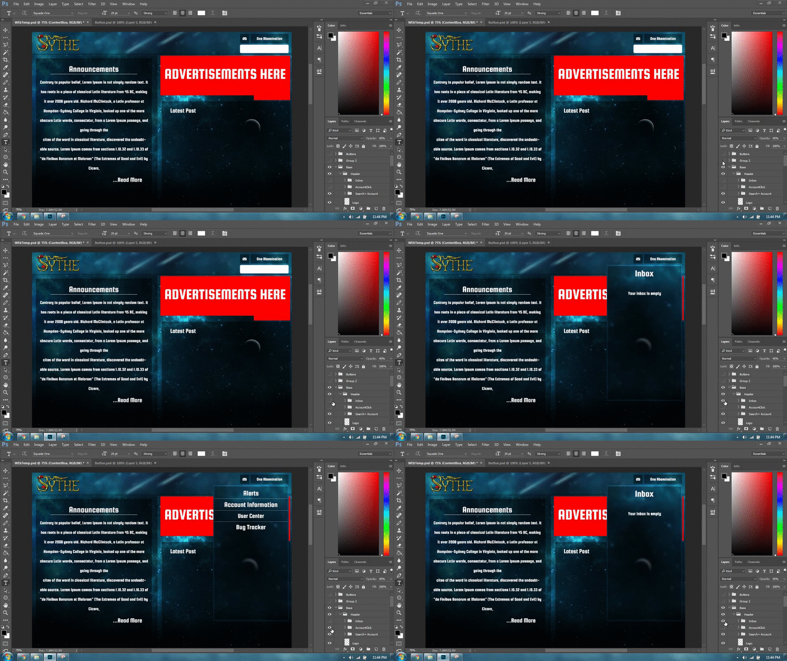
Anyways, I don't have a specific theme in mind, but I threw something together to maybe get a rough draft idea across as a landing page, but this wouldn't by any means be a final copy, just a bit of dabbling.
The "latest posts" box could be used for anything, split up or even changed completely it's just there for filler tbh
Apprentice
- Joined
- Apr 22, 2013
- Sythe Gold
- 101
- Messages
- 815
- Discord Unique ID
- 206408225694679041
- Discord Username
- bumbum
what about something like this.yeah I'm not graphic designer lol
maybe as background colours rather than foreground


- Joined
- Apr 21, 2005
- Sythe Gold
- 5,470
- Messages
- 8,074
- Discord Unique ID
- 742989175824842802
- Discord Username
- Sythe
Ye maybe you pick the colours lolwhat about something like this.
--->
Apprentice
- Joined
- Apr 22, 2013
- Sythe Gold
- 101
- Messages
- 815
- Discord Unique ID
- 206408225694679041
- Discord Username
- bumbum

- Joined
- May 8, 2016
- Sythe Gold
- 273
- Messages
- 241
Honestly can't give feedback without an actual illustration of what its going to look like. Right now we only have drafts which inclines me to say that I'd still prefer the look right now.
If there was a clear cut illustration as to how it would look like, that opinion might/might not change.
If there was a clear cut illustration as to how it would look like, that opinion might/might not change.


Legend

- Joined
- Mar 11, 2013
- Sythe Gold
- 1,455
- Messages
- 11,195
- Vouch Thread
- Click Here
- Discord Unique ID
- 108718183925465088
- Discord Username
- twodoorcinemaclub
For this, it could be responsive and when the mouse hovers over it the two options appear.what about some animation? lol

Apprentice
- Joined
- Apr 22, 2013
- Sythe Gold
- 101
- Messages
- 815
- Discord Unique ID
- 206408225694679041
- Discord Username
- bumbum
Ye that's what it's supposed to beFor this, it could be responsive and when the mouse hovers over it the two options appear.


- Joined
- Mar 20, 2015
- Sythe Gold
- 1,026
- Messages
- 5,165
- Discord Unique ID
- 212649581656145922
- Discord Username
- Buyacc#7886


I like the ideas so far. What I think would be the best way to order the tabs is by making every subforum a seperate tab (Our Community, Runescape Markets, Other Game Markets, etc) and then put everything that can be found in the subforum in the dropdown menu (like other people have already shown in this thread). An example would be:
Other Game Markets
The reasoning behind this is that if we do it on a more detailed scale it gets too complex and big imo (the menu). An idea could be something like Bumbum made, using the subforums instead of the detailed subforum (so not a specific game as a tab) and then the dropdown menu similar to my example.
Just my 2 cents.
Other Game Markets
Pokemon Go Marketplace
League of Legends Market
Overwatch Market
World of Warcraft
FIFA Market
Counter-Strike: Global Offensive Market
Other MMOs
Other Games
League of Legends Market
Overwatch Market
World of Warcraft
FIFA Market
Counter-Strike: Global Offensive Market
Other MMOs
Other Games
The reasoning behind this is that if we do it on a more detailed scale it gets too complex and big imo (the menu). An idea could be something like Bumbum made, using the subforums instead of the detailed subforum (so not a specific game as a tab) and then the dropdown menu similar to my example.
Just my 2 cents.
Apprentice
- Joined
- Apr 22, 2013
- Sythe Gold
- 101
- Messages
- 815
- Discord Unique ID
- 206408225694679041
- Discord Username
- bumbum
So something like this? Top Navigation BarI like the ideas so far. What I think would be the best way to order the tabs is by making every subforum a seperate tab (Our Community, Runescape Markets, Other Game Markets, etc) and then put everything that can be found in the subforum in the dropdown menu (like other people have already shown in this thread). An example would be:
Other Game Markets
Pokemon Go Marketplace
League of Legends Market
Overwatch Market
World of Warcraft
FIFA Market
Counter-Strike: Global Offensive Market
Other MMOs
Other Games
The reasoning behind this is that if we do it on a more detailed scale it gets too complex and big imo (the menu). An idea could be something like Bumbum made, using the subforums instead of the detailed subforum (so not a specific game as a tab) and then the dropdown menu similar to my example.
Just my 2 cents.
- Joined
- Mar 20, 2015
- Sythe Gold
- 1,026
- Messages
- 5,165
- Discord Unique ID
- 212649581656145922
- Discord Username
- Buyacc#7886


Big Chungus

- Joined
- Sep 26, 2015
- Sythe Gold
- 743
- Messages
- 703
- Discord Username
- Frog#1153


This would be really cool. Support


A Beautiful Soul and a Heart of Gold. <3


Personally if the grid can be on the homepage where the forum is still accessible and easily view-able I'd be ok with that. Otherwise if I was a newcomer/user again... a grid of pictures would not want me to stay or be involved. I'd rather be able to instantly see the forum and the participation etc happening. Rather than being faced with a grid of pictures.
I like the concept however, I just don't know about forcefully having it for new-users, I don't know if that's a personal opinion. It might be a good idea, but it might be a turn off as well.
I like the concept however, I just don't know about forcefully having it for new-users, I don't know if that's a personal opinion. It might be a good idea, but it might be a turn off as well.
Last edited:



- Joined
- Jun 8, 2015
- Sythe Gold
- 260
- Messages
- 4,654
- Location
- UK, China, Hong Kong
- Vouch Thread
- Click Here
- Discord Unique ID
- 560804703760416789
- Discord Username
- runevip


Some of the grid concepts would be great for a mobile device version of the site.
As for the desktop version the banner concepts look better as they don't take up as much page space
As for the desktop version the banner concepts look better as they don't take up as much page space
Similar threads


- Replies
- 16
- Views
- 648


- Replies
- 30
- Views
- 1,050


