• Log in or sign up for an account here: https://www.sythe.org/login

Banners

Joined
Jul 30, 2015
Sythe Gold
975
Messages
1,319
Supporting Business
I thought my banners were shit, at least quite abit of of them are.

So I went to google images and searched gaming related banners. I analyzed the sort of texture, shaping, and style that is used and decided to apply it to my future work here:
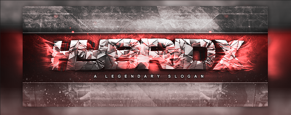
d5c6dc74f7d816e7cf6d51df15b88043.png


ztAG1XF.png


0x3wzoh.png


L5wCoNa.png


UuJ6wrW.png


eicDlvY.png


kat7DLc.png
 
Last edited:
Supporting Business
Really cool work, I would recommend changing some of the fonts you use. Something more smooth or crisp would like nicer IMO.
For example,
e2a391f9a13948dfb568b9d6c6d00bfe.png
this is too visible on the banner. It should be more secondary.

But everything else looks really good, keep it up!

Thanks for the feedback :)

So usually secondary info is less visible?
 
In Memory of Jon
Community Participant
Supporting Business
Two Factor Authentication User
GFX Forum Participant
Sythe Awards 2017 Winner
You should aim to make the banners easy on the eyes, simple to read, and aesthetically sound. Ideally banners/logos should be simplified.

b7316e9009.jpg


This looks good.
agreed in fact everything looks stunning to me
 
Nice job but I would try cleaner text. I'm not a fan of the 3d broken text for the first few images but it gets better.
 
Last edited:
The compo and flow of the banners is quite nice though if you had some nice lighting to create some type of contrast it would work wonders.
 
wow good stuff. I just started off making graphics and love your work. You have inspired me!!
 
Last edited:
Runescape Gamblingrunescape gambling
Back
Top