• Log in or sign up for an account here: https://www.sythe.org/login

My recent, works. [Advice needed]

Matt Hasty

SPAMMER

Do Not Trade
Joined
Jul 24, 2009
Sythe Gold
90
Messages
1,281
Age
33
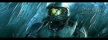
I created these within a half hour each, its not a lot of work just constant redoing something after I finished it. I need some advice though, on how to do smudging; anyone know any great tutorials I searched basically everywhere and can't find any.

2yubo1d.jpg


2q0k9he.jpg
 
There bad(no offense) You don't always have to have text in sigs. deviantart.com for tutorials just search for sig tut. Try playing around with different tools and effects.
 
There bad(no offense) You don't always have to have text in sigs. deviantart.com for tutorials just search for sig tut. Try playing around with different tools and effects.

Your no one to judge on anyones work "no offense", also please learn to critique, anyone can just say something is bad, and to go read some tutorials; but what parts of the signature did you not like? Was it her boobs, because I can totally make a non Heterosexual signature for you next time.

Before you, say anything about "learn to take criticism", learn to critique; and we wont have any problems.
 
I wasn't giving you honest criticism but since you decided to flame me. I will give it to you.

#1.
Has no effects added to it besides a duplicated render and flip maybe a lighting effect. Text is HORRIBLE slapped on the render. Over contrasted on the top and low contrast on the bottom. Low quality to.

#2.
Colors do nothing to help it use the color wheel. All you've done to it is add a blue overlay to the top right. again text is HORRIBLE.

Who are you to tell me I am no one to judge some ones work? My work is 100x better than anything you've accomplished and would be GLAD to rape you in a battle.
EDIT:
And you ASKED for tutorials.

As cheesy as a "graphic battle" sounds, I'm going to have to pass; your work is messy and as unoriginal as an emo kid with raccoon strips in his or her hair. I also didn't say mine was any better. Learn to critique, and go read some tutorials yourself.

Good day.

If anyone else has any other inequivalent information, please state it below. Either than that this thread can be closed.
 
Please post what you think is unoriginal. You really should stop.

And you think this is clean?

2q0k9he.jpg


Where are you getting that i said you should read tutorials?
 
skatttttte.png


result.jpg


This is just an example, of how unoriginal your work is. I seen it all before, and its like you don't try to do something different you just look and copy.
 
Two completely different outcomes? All that i see the same are the lines. If you would have looked at the date i made it was a good 2-3 months ago. Heres some of my newer work

paramogrg.png


eyeee.png


painnnn.png


kjj.png


Edit: In my first post i was simply giving you what you asked for Advice.
 
Matt Hasty, you asked for advice. And he gave it to you. Stop getting all mad about what he said. If you don't like it, don't ask for it.

OT: The first one looks like you barely did anything to it. A couple flips, gradient, text, and a brush or two? It really doesn't look good, in my opinion.

The text looks TERRIBLE on the second one, and really doesn't look clean. Keep working.
 
I've seen worse. But your second one has a blue overlay that ruins the piece. Maybe lower the opacity of that layer or set it to Soft Light.

Also, Lady Gaga is my thing. ;)
 
Please read the stickies before posting on this forum, one of them says to LISTEN to other artists. w000t is pretty good at gfx imo. i suck at it but ima try to critique.
the title does say "ADVICE NEEDED".....

#1 looks simple. text doesn't work.

#2 stock with blue color overlay? text still looks bad.

Even if people say "Text is bad" dont stop putting them in your sigs, i mean how else are you gonna learn? am i right(YES!)?

look at tuts, googling sig tut will get you lots of tuts! thats how im learning.
Good job!
Edit: Jk your shit fucking sucks.

If you can't take criticism then get the fuck of the Internet and playing with your "imaginary buddies"
 
oh)= matt hastey and w00t why did you stop arguing it was funny as shit.
but heres my C&C:
1st one: you flipped the render nice!
2nd one: you actually did work though like some adjustments some gradients much better then the first. But the text sorta hurts it

keep doing work
 
As cheesy as a "graphic battle" sounds, I'm going to have to pass; your work is messy and as unoriginal as an emo kid with raccoon strips in his or her hair. I also didn't say mine was any better. Learn to critique, and go read some tutorials yourself.

Good day.

If anyone else has any other inequivalent information, please state it below. Either than that this thread can be closed.

Don't post in the GFX Showcase expecting no criticism.

All I notice is BADLY done text and pixelated renders.

http://sythe.org/showthread.php?t=708548
 
As cheesy as a "graphic battle" sounds, I'm going to have to pass; your work is messy and as unoriginal as an emo kid with raccoon strips in his or her hair. I also didn't say mine was any better. Learn to critique, and go read some tutorials yourself.

Good day.

If anyone else has any other inequivalent information, please state it below. Either than that this thread can be closed.

shut the fuck up and never post in this forum again you cretin
 
Your no one to judge on anyones work "no offense"

How awfully ostentatious of you! He is actually an incredibly skilled artist, and is a far more respected asset than you are, purely since his critique is genuine, and his skill is undoubted. Your signatures are bad for the following reasons, just to deflate your head;
- You clearly have no concept of lighting in your work.
- Borders are used inefficiently in your work, and they are of a style that you do not use.
- Your signatures lack any interesting concepts, horizontally flipping a layer takes three clicks.
- Your signatures seem to lack effects of any sort.
- You show no understanding of any colour theory, etc etc.

Now take criticism on the chin you BOMBACLART.

Was it her boobs, because I can totally make a non Heterosexual signature for you next time.

Your sarcasm isn't up to scratch. I'd give you constructive criticism on your humour, but this is the wrong forum for that, and that would take too much of my time.
 
- You clearly have no concept of lighting in your work.
- Borders are used inefficiently in your work, and they are of a style that you do not use.
- Your signatures lack any interesting concepts, horizontally flipping a layer takes three clicks.
- Your signatures seem to lack effects of any sort.
- You show no understanding of any colour theory, etc etc.

That's all I was asking for, thanks. And "bombaclart"? Right back at you. =)
 
Picture #1: Who cares about minimal effects and flipped this and gradient that..
Its Katy Perry..
'nuf said.
 
Runescape Gamblingrunescape gambling
Back
Top