Thought I'd post a little example of some important criteria that I posted on a far more graphically inclined site, to get things rolling.
>Style
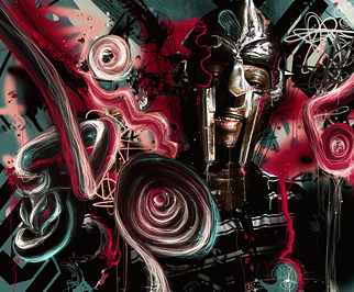
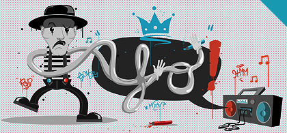
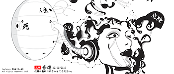
Style requires distinguishable features in the tag itself, showing the artist to be developing their own initiative, rather than following a trend or a 'set' style. This may be through the elements of the actual tag (such as the fourth - mks' tag, where the style of the drawing is quite unique in terms of small details, carefree attitude towards perfect geometry and the combination of tablet painting and smudge), or it can be more through the actual method of creating the tag (such as the first and fifth tags, with the first resembling a typical photomontage, yet the sharpening and perfect lines of the digital elements creating something beyond typicality. The second is once more a combination of usual styles, with photomanipulation being combined with watercolour effects, creating a pleasing result).
>Depth
A common misconception is that Depth is simply about using the blur tool/gaussian blur. Depth is everything from the created atmosphere to the depth of field, and a signature with an emphasis on depth will be able to portray either a photo-realistic scene in terms of blur and aperture, or a clear knowledge in the separation of foreground, middleground and background. As can be seen by tags 1 and 2, depth doesn't wholly require blur - depth can be created through size differences (as done in the first), or as earlier mentioned, through the distinct separation of foreground, middleground and background (as seen in the second).
>Flow
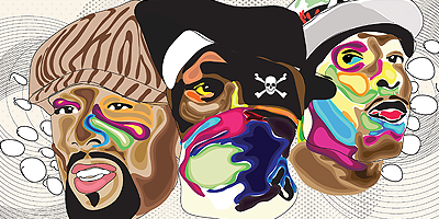
Flow is pretty self explanatory to the extent that I consider a detailed explanation into how the eyes perceive shapes and move along an image, to be unnecessary. Typical flow consists of a focal point which is effectively positioned to either lead to the various elements of a tag (with effective flow showing consideration for the placement of different elements), or with the elements actually emphasising the focal point through direction. Whilst the easiest method of adding flow is to create direct linear paths (as shown in tags 1, 4 and 5), other methods such as creating flow through placement (such as 2 and 6) and through the edges of shapes/elements (such as tag 3) are also possible.
>Composition
Composition is ultimately how a piece of work is composed. Everything from choices in colour, to the placement and positioning (or the juxtaposition of) the focal point, the effects, secondary elements, the background, etc all contribute to the composition, and a well thought through composition will have appeal without needing meaning in the elements themselves (resulting with 'abstract' tags). Simplicity, detail, and the correspondence of various shapes are all various factors which add into the composition of the tag - all of the ones I chose combine a plethora of ideas in regards to composition, in order to be effective.
>Appeal
Appeal is more relative to the person observing the tag, yet it is still only partially subjective - appeal usually comes through general skill, unique methods or unseen ideas being used in a tag. All of the tags shown either excel in the styles they are in, stand out amongst other amazing tags, or simply possess uncommon characteristics making them appeal to me.
>Lighting
Lighting takes into account another important factor to the realism of the tag - the different light sources and their effects. Everything from the actual creation of light sources to the effect the light has (in terms of colour, luminance and relation to setting - such as ambient or spot lighting) on the surroundings needs to be accounted for, to create an effective tag.
>Own Tag Criticised

Whilst this tag attempts to bring elements of realism into an abstract piece (with shadows on a few elements, attempted depth and such), there are a few key issues with the tag at hand. Firstly, compositionally the detailed elements are all driven inwards, causing the focal point to be nearer the centre. This also results with a lot of wasted negative space around the outside of the tag, particularly near the top and bottom (where the background could be elaborated upon, or more elements could be placed). The different colours at the top also draw a lot of attention away from the intended focal point, and the top is too bright for the secondary role it is meant to play in the tag. The lighting could be elaborated upon, with more detail in the lights/shadows, and generally the depth is lacking. The flow is also mildly confusing due to the edges of the shapes contrasting with the directions of the thinner details. On a positive note, the work displays a general understanding of colours. To improve, the main points would be the composition, addition of details and more care with lighting and such.