

You are using an out of date browser. It may not display this or other websites correctly.
You should upgrade or use an alternative browser.
You should upgrade or use an alternative browser.
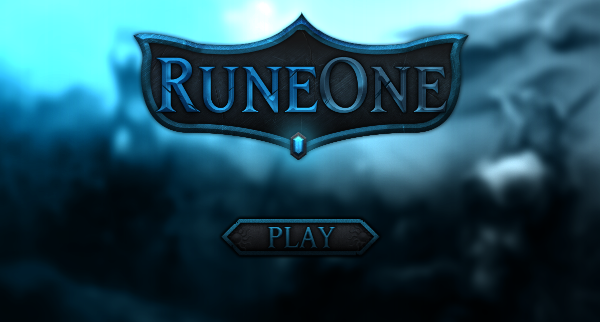
Fantasy MMORPG Logo
- Thread starter Swaghetto
- Start date



Formerly known as DisabledDude

Nice job on this!



- Joined
- Apr 10, 2018
- Sythe Gold
- 2,289
- Messages
- 15,279
Not bad!

this is clean, love the colours to. 'im a sucker for blue'

Mimir
Active Member
- Joined
- Jun 23, 2020
- Sythe Gold
- 138
- Messages
- 144
- Age
- 33
Looking nice, I think a bit of a lighter contrast would have made it nicer, specially on the 'Play' button, since it's kinda lost with the background as it's all too dark. If you added a bit of shine around each banner, it would make it pop up from the background and give it a shiny sensation, like metal.
