
• Log in or sign up for an account here: https://www.sythe.org/login

Signature Feedback

XX_PLANKER_xx

Grand Master

$5 USD Donor New
Joined
Feb 24, 2007
Sythe Gold
14
Messages
2,476
Location
Location: Location:
Not sure if srs or just newfag...
Two Factor Authentication User
Wubba Lubba Dub Dub
MushyMuncher
Wait, do you not have an Archer rank?
Halloween 2014
CnC please. Its supposed to look like carved wood... if that's not obvious.

​
nevar forget 12/1/2013 RIP in peace​
 
Two Factor Authentication User
Well, i don't know if that reflection that passes over the text fits to carved wood. But that is just my opinion, The rest looks quite good. I like it. :D
 
Not sure if srs or just newfag...
Two Factor Authentication User
Wubba Lubba Dub Dub
MushyMuncher
Wait, do you not have an Archer rank?
Halloween 2014
Well, i don't know if that reflection that passes over the text fits to carved wood. But that is just my opinion, The rest looks quite good. I like it. :D

Its varnished. lol, jk I know what you're saying. I might consider another material but I feel like wood is fitting for now, what with my name.

Extremely boring. Also don't like the depth of the text, too deep.

If your goal was carved wood, I'd say spot on!

I agree, I think the angle I used is a bit too steep, I think a more straight on angle may be more appealing. I wanted it to appear like you're looking up at it.
Maybe I can find a serif font to spice it up, or add better animations, or thurasi lol. I need to teach myself animation in flash.

I don't mind it, but personally find the colors and font a tad boring.

Thanks for the feedback. I was going for something really legible and easy to read. I also like the cartoon-ish feel. The colors are pretty bland, ill agree with you on that. But for wood I dont know what else I'd do really.

tbh I didnt know you did gfx donald, do you have any work I could see?
 
Potamus
Mr. Peanutbutter
Member of the Month Winner
Christmas 2013
Two Factor Authentication User
too much depth and weird camera placement. gj on the wood tho
 
Not sure if srs or just newfag...
Two Factor Authentication User
Wubba Lubba Dub Dub
MushyMuncher
Wait, do you not have an Archer rank?
Halloween 2014
too much depth and weird camera placement. gj on the wood tho

I think Ill try adding a floor shadow next time and taking the angle higher.


Here's an xmas one to show off... Im certain its too big but I cant shrink it down without it looking like total shit. Edit: I think its fine because its hosted off site.
34fbc48.gif

CnC maybe? Maybe just tips since there's a lot to criticize.
 
Potamus
Mr. Peanutbutter
Member of the Month Winner
Christmas 2013
Two Factor Authentication User
Plank ava is awesome but the sig is just a bit, idk bland? Get more saturation in there mate! Kiu!
 
Not sure if srs or just newfag...
Two Factor Authentication User
Wubba Lubba Dub Dub
MushyMuncher
Wait, do you not have an Archer rank?
Halloween 2014
Plank ava is awesome but the sig is just a bit, idk bland? Get more saturation in there mate! Kiu!

Ya It needs a background or something for depth. Keep in mind in limited to 500x100 since im not a donor :( Ive made some adjustments and will make a few more before I enter SOTM.

I dont really know what to think of the snow. Its awkward because it clips around the edges but I dont think shrinking the snowy area would look any better. I really want to learn how to do a snow effect in C4D. Photoshops just no good for animation. Atleast what I know now. I essentially can just tween two images lol.
 
the animation kills it for me. If you are trying to have a wooden feel then i definetly think you should remove that.
 
Not sure if srs or just newfag...
Two Factor Authentication User
Wubba Lubba Dub Dub
MushyMuncher
Wait, do you not have an Archer rank?
Halloween 2014
the animation kills it for me. If you are trying to have a wooden feel then i definetly think you should remove that.

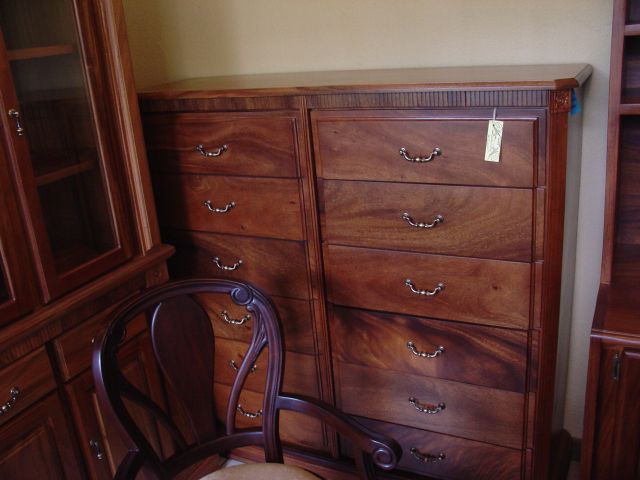
The shine? Id keep it but fix it up a bit and make it less thick, more spread out and probably not under the letters as that doesnt make much sense. I think the angle I took it at is whats really throwing the whole thing off. I might even try going for a different type of wood like mahogany or something dark which looks good varnished.

Like this, its nice and shiny. :)

tropical%20hardwood%20furniture%2001.jpg


I think I know enough to fix the OP, Please just CnC this new xmas one.
 
Runescape Gamblingrunescape gambling
Back
Top